Kulture Magazine
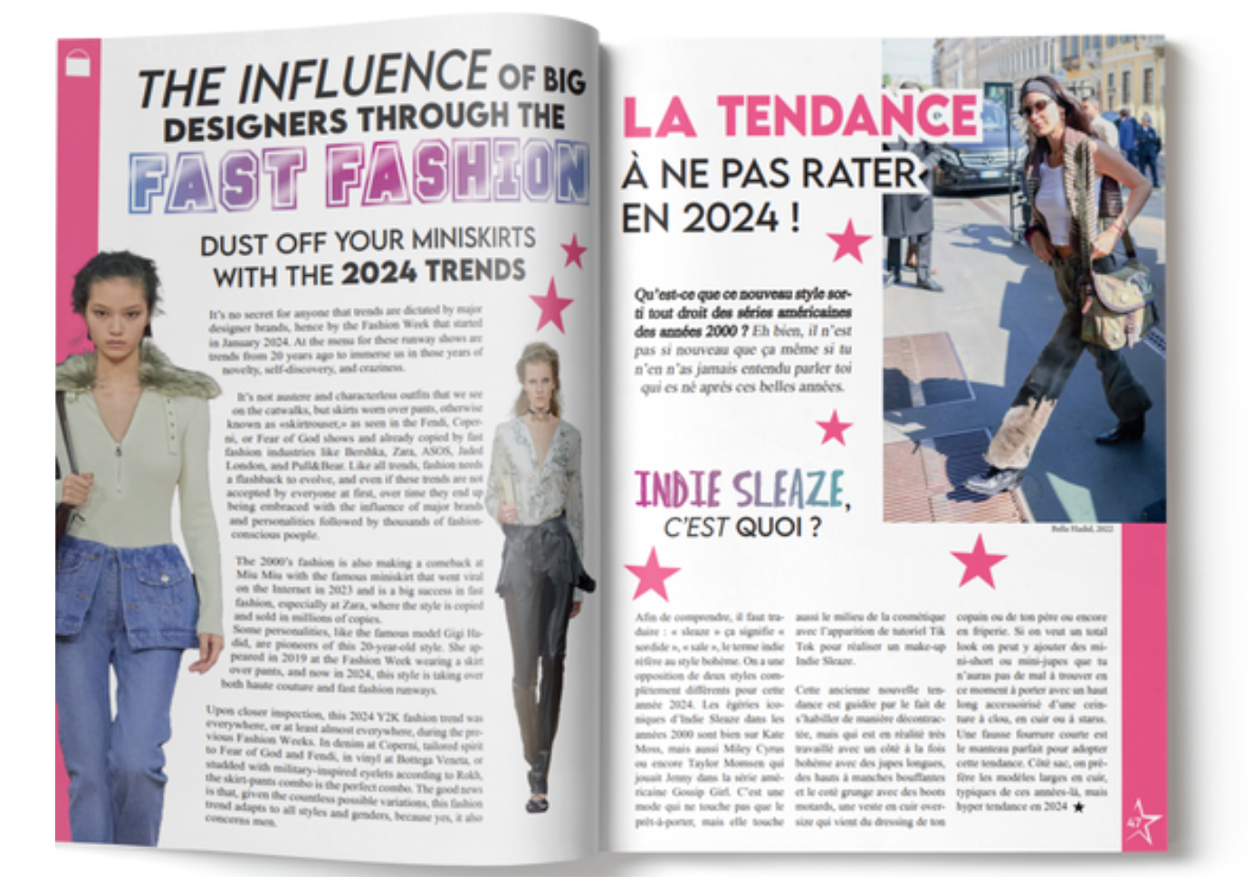
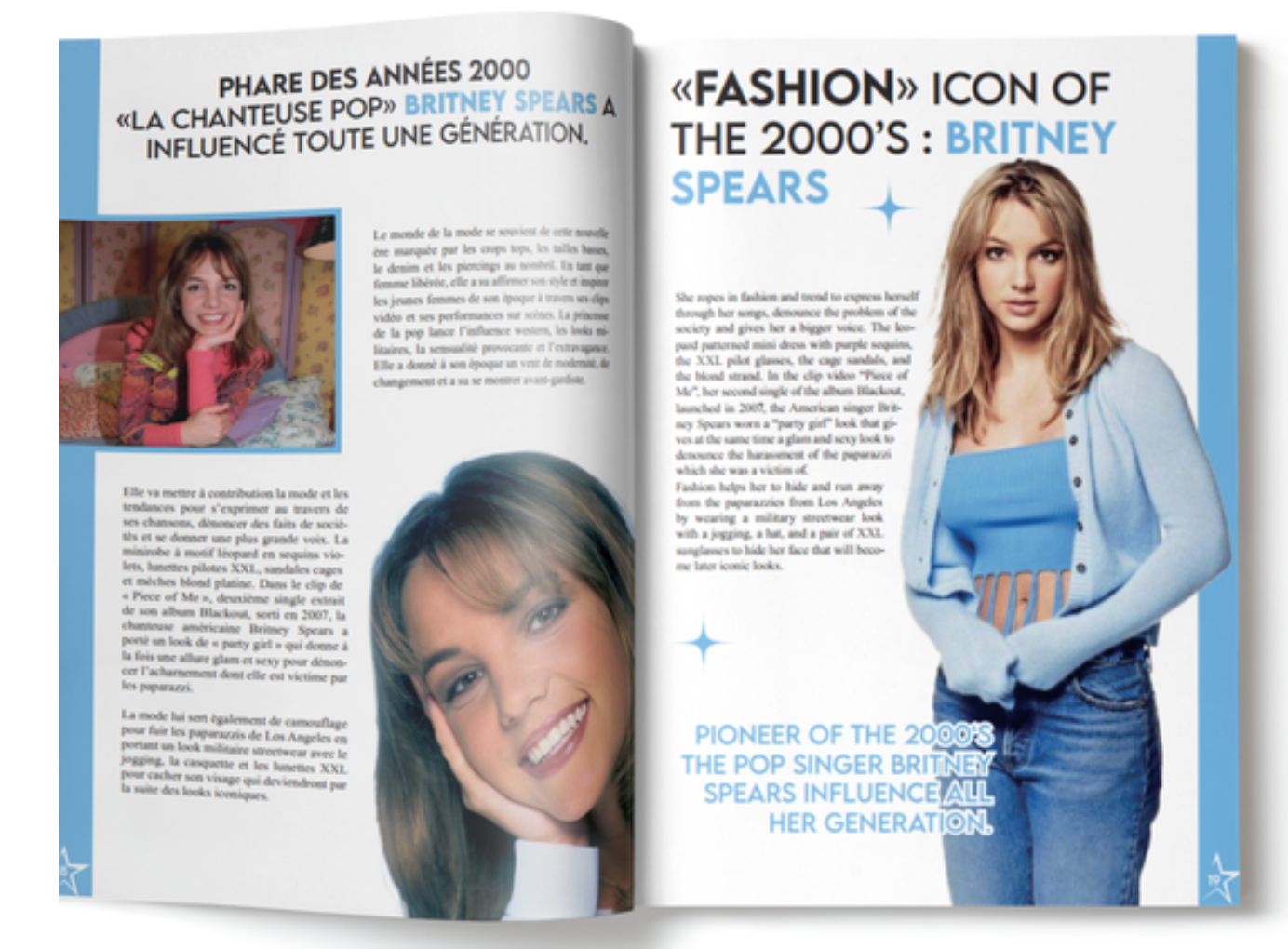
I had the opportunity to create "Kulture Magazine" as part of my second-year Bachelor’s project. Focused on the resurgence of 2000s fashion trends, the magazine explores the impact of fashion on society. As Artistic Director, I shaped its visual identity, oversaw photo shoots, and ensured aesthetic coherence, completing the project after over 100 hours of dedicated work.
The Logo :
The logo's big "K" represents recognition, while the star symbolizes light, harmony, a multidimensional vision, and inclusion. The pink color of Kulture reflects the 2000s, warmth, attention-grabbing appeal, and feminine traits.
The content :


The Shooting :
The photoshoot is titled "Summer Vacation", capturing the theme of young adults on a road trip with friends in a 4x4.
The Magazine :